Free Value Checker
See any photo or painting in true perceptual grayscale and read its values on the 1–10 scale artists actually use. Exports PNG and JPG. Free, with no sign-up, and your picture never leaves your device.
Drop an image here, or paste from clipboard
Your image stays on your device. Nothing is uploaded.
JPG, PNG, WebP, GIF, AVIF or BMP
Two value probes.Set probes A and B to read two values at once and see how many steps apart they are.
Value histogram.Plots every pixel from value 1 at the left to value 10 at the right, marking your picked point.
Check my painting.Your painting photo is lined up with the reference, then compared area by area.
Export PNG with value strip.Adds 10 numbered gray steps down the right edge of the full-resolution grayscale.
- Free
- No sign-up
- Runs in your browser: your image never leaves your device
What is a value checker for artists?
A value checker, or tonal value checker, converts a color image to grayscale to show how light or dark each area really is, without color fooling your eye. This one also reports values on the 1–10 scale painters use, shows a histogram of the whole image, and can compare your painting's values against its reference.
How to use the Value Checker
The tool takes 8 steps, all on your device.
Drop or paste your reference photo (or a photo of your painting) into the tool, or click “Choose image”. Nothing is uploaded: the image is read by your browser.
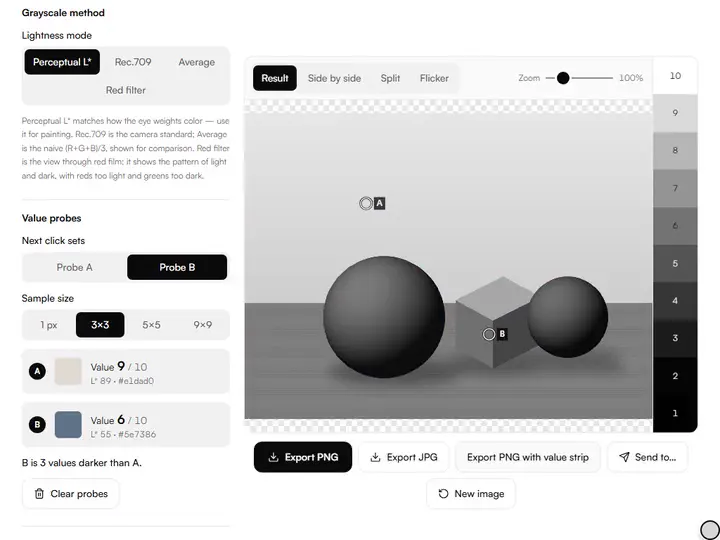
Pick a Grayscale method: Perceptual L* is the default and matches how the eye weights color.
Click the image to set probe A, then again for probe B. Each reads value (1–10), L* and color over the sample size you choose, and the panel says how far apart they are.
Drag the split slider to compare the grayscale against the original, or switch to Side by side or Flicker view.
Turn on “Highlight probe A's value” to mark every area near A's value, with the share it covers.
Watch the histogram: it shows where the image's values bunch up, with lettered markers for probes A and B.
Optional: under “Check my painting”, add a photo of your work; it is aligned to the reference and the Difference view colors what reads lighter or darker.
Export the grayscale as PNG or JPG, or export a version with the 10-step value strip attached for printing beside your easel.
What the Value Checker does
The Value Checker turns a picture into perceptual grayscale, reads it on the artist's 1–10 scale, compares it four ways and maps value errors.
Perceptual grayscale
The Value Checker converts color to gray through OKLab lightness, which follows how light a color looks rather than how a camera recorded it. Among our value and tone tools for artists, it is the one that measures a reference before anything is simplified.
The artist's 1–10 scale
Every reading lands on the artist's value scale, where 1 is the darkest dark and 10 is the white of the paper.
Four compare views
The compare stage offers Result, Side by side, Split and Flicker views. Flicker swaps color and gray every 600 milliseconds, so a value shift shows up as movement.
A map of value errors
Check my painting finds your canvas in the photo, aligns it to the reference and compares both lightly blurred. Blue marks darker areas, orange lighter ones, and any region or value band off by half a value is named.
Full-resolution export
The preview runs on a copy up to 1,600 pixels on its long edge, while PNG and JPG exports use the full-resolution image.
Private by design
The Value Checker does its pixel work in a Web Worker in your browser, so your image is never uploaded. The grayscale method, probe sample size and highlight settings stay in the page address for bookmarking.
Worked examples from the Value Checker
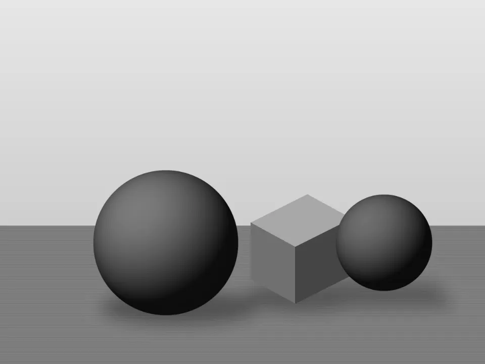
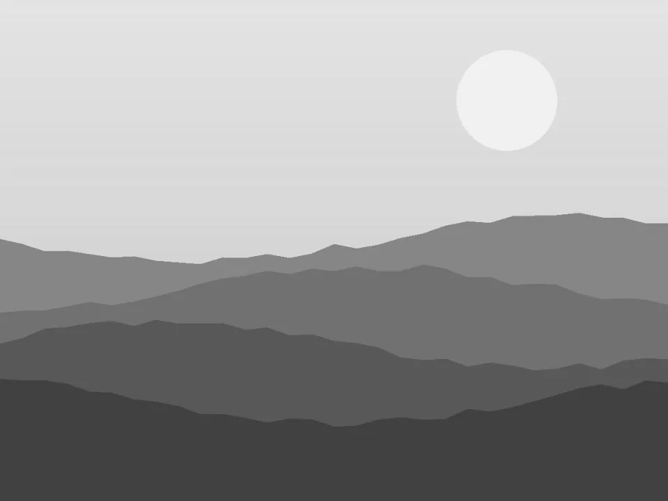
Each picture is what this tool exported from one of the sample photos you can load in it.
A still life read in grey
- What was set
- The Still life sample, Grayscale method left at Perceptual L*, Result view.
- Why
- Colour hides value: the red sphere and the green one look different but sit close in value. In grey you see which shapes will merge on the canvas before you mix anything.
A landscape read in grey
- What was set
- The Landscape sample, Perceptual L*, Result view.
- Why
- Hills that step back in a landscape should step up in value. The grey view shows whether each ridge is a clear step lighter than the one in front of it.
Painters and teachers checking what the eye misjudges
Working painters, art students, art teachers and beginners each bring a different value question to the checker.
Working painters
Working painters can photograph the canvas after a session and run Check my painting against the reference.
Art students
Art students can switch grayscale methods on one colorful photo to see how each method moves the values.
Art teachers
Art teachers can print the value-strip PNG so a class checks its mixtures against the same ten steps.
Beginners
Beginners can guess an area's value, then click it and check the guess against the probe readout.
Why does value matter more than color?
Value matters more than color because a picture reads from across the room by its values. Value, how light or dark something is, carries the drawing, the form and the light; accurate values with approximate color still convince, and beautiful color with weak values falls apart.
Reading the histogram like a painter
In the histogram, look for one dominant mass against a smaller dark or light accent; a flat smear from end to end makes a busy picture, and a narrow band a low- or high-key one.
A “white” cloth in shadow often reads value 6 or 7, not 9: seeing that corrects the habit of painting the white you know instead of the grey you see.
With no dominant mass, test the design at its simplest: the notan generator shows whether the light–dark pattern holds at two or three values.
The settings, explained
Compare views: in Split or Result view, the space bar toggles the original for an instant manual flicker.
Check my painting: if the automatic match looks doubled in the Difference view, Adjust corners lets you place the painting's corners by hand.
Exports: after the grayscale, the value study maker reduces the reference to 2–10 flat steps.
Further reading
The page below goes further into the ideas the Value Checker works with, and opens on the site named beside it.
- Value, tone and why they matter in drawing and painting (ArtisticMasterclass.com)
Tips from a working artist
From Sujith Puthran, artist and founder: what I actually do at the easel.
If your painting keeps coming out flat, compare histograms with the reference. Nine times out of ten the painting's darks are two steps too light.
Use the strip export as a physical mixing gauge: mix a puddle, dab a dot on the printed strip next to the step you aimed for, and judge it when it dries, not wet.
Squint at the grayscale, not the color original, when you choose what to simplify. The shapes that survive the grayscale are the ones that will carry the picture.
Away from the desk, the Live Camera Studio shows grayscale values live through a camera, with two value probes.
Common mistakes, and the fix
The 3 mistakes below are reading one pixel, comparing photos taken in different light, and chasing all ten values.
Reading one pixel
A single pixel of a photo can be noise or a speck of glare. Raise the sample size so each probe averages a small patch, and read that.
Comparing a painting photographed in different light
A painting shot under a warm lamp will read darker and duller than its reference. Photograph it in even light, then correct the colour with the white balance tool before you compare.
Chasing all ten values
The scale has ten steps so you can name what you see, not so a painting uses all of them. Find the lightest light, the darkest dark and the value of the biggest shape first; most pictures hold together on four or five.
Why your picture stays on your device
The Value Checker is a program your browser downloads and runs by itself. When you choose a picture, the browser reads it from your files and does the work on your own phone or computer; no copy is sent to this site or to anyone else, and what you export is saved straight from the browser. That is why there is nothing to upload and nothing to sign up for. The privacy page says what the site does collect.
Questions about the Value Checker
The 7 questions below take the theory of grayscale and the 1–10 scale first, then the modes, the readout and the comparison.
The theory
Why not just convert to grayscale in my phone's editor?
A phone editor's grayscale filter uses its own channel mix, and a plain channel mix misjudges saturated colors. The perceptual L* mode here converts through OKLab, which is built to track how light a color looks, so the grayscale agrees with what you see when you squint.
What do the numbers 1 to 10 mean?
The numbers 1 to 10 are the artist's value scale: 1 is the darkest dark you can make, 10 is the white of the paper (or the brightest light), and the steps between are even perceptual greys. When a painter says “that shadow is a 4”, this is the scale they mean.
Using it
Which grayscale mode should I use?
Use the Perceptual L* grayscale mode for painting decisions. Rec.709 only if you are matching video or camera workflows. Average is included for education: switch to it and see how badly it judges yellows and reds.
What is the Red filter mode for?
The Red filter mode is for imitating a look through a sheet of red film or a red value finder. Everything turns to one color, so the shapes of light and dark are easier to see. Reds and oranges come out too light and greens and blues too dark, so use it to judge the pattern and Perceptual L* to read a value.
Why does the readout show values like 6.5?
The readout rounds each reading to the nearest half step, so a color between two steps shows as 6.5. The L* figure beside it gives a finer reading from 0 to 100.
How accurate is the “Check my painting” comparison?
The comparison is only as accurate as your photo. The painting is aligned by its big value masses and compared after a light blur, so broad value errors count more than small offsets or brush texture. Glare, a color cast or dim light shift every reading; the range check ignores each photo's brightest and darkest 2%.
Does the Value Checker upload my image?
No, the Value Checker does not upload your image. You can disconnect from the internet after the page loads and everything still works.
Drop in a reference or a photo of your painting and read its values on the 1–10 scale.
Free · No sign-up · Runs in your browser
Why next: Once you can read the values, group them into a few flat steps you can paint from.
Why next: Cut the picture down to two or three values to test whether the design holds.
Why next: Melt the small detail away so the big shapes you just measured are easier to see.
Last updated 2026-10-07 · Built by Sujith Puthran