Free Masterwork Palette Library
Study the palettes of 30 public-domain masterworks, from Duccio around 1290 to Henri Rousseau in 1908, at The Met and the Cleveland Museum of Art. Choose 4 to 12 colours, read each colour's share of the picture and its value, and take the palette into your painting software or the paint mixing simulator. Exports ASE, GPL, CSS, JSON and CSV. Free, with no sign-up, and it runs in your browser.
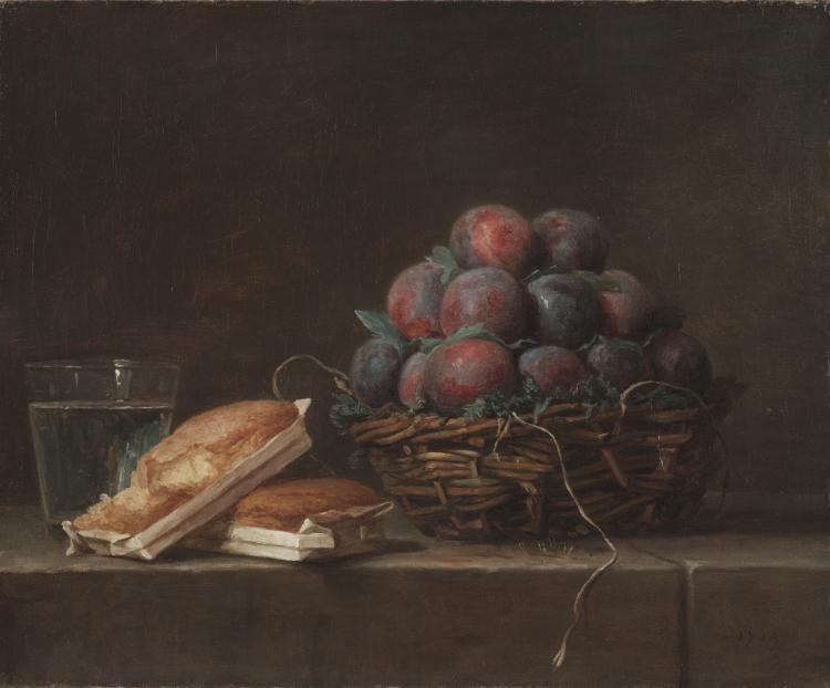
30 public-domain and CC0 paintings from The Met and the Cleveland Museum of Art, read from their open-access APIs on 2026-09-29. Images load from the museums’ own servers; The Met’s image server sets its own cookies.
30 open-access masterworks.Paintings from 1290 to 1908, 22 at The Met and 8 at the Cleveland Museum of Art, each read from the museum's API.
4 to 12 colours.Every palette at every size from 4 to 12, each colour with its share of the picture and its value from 1 to 10.
Mix any colour.Send a palette colour to the paint mixing simulator and get a recipe from your own paints.
Six export formats.ASE, GPL, Procreate swatches, CSS variables, JSON and a CSV with the artwork's credit line.
- Free
- No sign-up
- Runs entirely in your browser
What is a masterwork color palette?
A masterwork color palette, or old master color palette, is the small set of colours that covers most of a famous painting, each with the share of the picture it takes up. This library gives 4 to 12 colour palettes for 30 public-domain paintings, measured from the museums' own open-access images by k-means clustering.
How to use the Masterwork Palette Library
The tool takes 5 steps, all on your device.
Browse the library below the palette, or search by title or artist and narrow by period and museum.
Choose a work: its image, details and palette appear at the top, with a link to the museum's own page.
Set the number of colours from 4 to 12 and order them by share of the picture, by value or by hue.
Copy any colour's hex code, or press its mix button to open the paint mixing simulator with that colour as the target.
Download the palette as ASE, GPL, Procreate swatches, CSS, JSON or a CSV that carries the artwork's credit line.

What the Masterwork Palette Library does
The Masterwork Palette Library holds palettes measured from the painting and not its backdrop, each verified at the source, with value on the painter's scale.
Verified at the source
Every work in the library was read from the Met Collection API or the Cleveland Museum of Art Open Access API, and kept only if the museum marks it public domain or CC0. Titles, dates, media, credit lines and links are the museums' own. Among our color tools for artists, it is the one for studying how the masters divided their colour.
How the palettes are measured
Each palette comes from the museum's web image, reduced to at most 240 pixels on its long edge, clustered by k-means in the OKLab colour space (k-means++ seeding from a fixed seed, 40 rounds). Each colour is the average of its cluster in linear light; its share is the part of the picture's pixels in that cluster.
The painting, not the backdrop
Some museum photographs show the canvas on a flat black backdrop. When the outer ring of the photograph is at least 90% one colour, the rows and columns made mostly of it are cropped away before measuring, as long as no side loses more than 6%, so a dark painted ground is never mistaken for the backdrop.
Value on the painter's scale
Each colour's value is shown on the 1 to 10 scale used across the site's value tools, from OKLab lightness, so the palette can be read as a value plan as well as a colour plan.
Images stay at the museum
The pictures you see load from the museums' own open-access servers each time; no image is copied or stored on this site, only the palettes measured from them.
Settings in the link
The chosen work, the number of colours, the order and your search are kept in the page address, so a copied link reopens the same palette.
For painters who learn from the masters
Art students, working painters, illustrators, designers and art teachers study the palettes to learn from the masters.
Art students
Compare the value spread of a Rembrandt and a Monet palette before a master copy.
Working painters
Take a master's palette into the paint mixing simulator and see which of your tubes reach it.
Illustrators and designers
Load a period palette into Photoshop, Procreate or a stylesheet in one download.
Art teachers
Show a class how much of a painting is quiet colour and how little is accent.
What a palette with shares tells you
A list of colours says little on its own; the shares say how a painting spends them. In Vermeer's Young Woman with a Water Pitcher, the six-colour palette splits the picture almost evenly: its two largest colours, a dark umber #473e31 and a grey #726f64, take 21.4% and 21.3%, and none of the six falls below 13%. In van Gogh's Wheat Field with Cypresses, a greyed sky blue, #788f95, leads with 29.4%, then a pale grey-green with 22.3%.
Rembrandt's Aristotle with a Bust of Homer shows the other extreme. At six colours, 44.2% of the picture is a single near-black brown, #090503; even at twelve colours the lightest cluster, #846c4b, covers under 1%. The lit sleeve and face are a small share of a mostly dark painting, and clustering averages them with their neighbours: the palette shows how little light the picture needs.
Reading value and hue
Order the palette by value to read the painting's tonal range from light to dark, and by hue to see its colour families together. A palette that bunches at a few values is a painting built on a narrow key; the value key analyzer reads the key of any picture, including a photo of your own work.
Screen colour and paint
Palette colours are measured from photographs, so they carry the photography's lighting and the varnish's colour as well as the paint. Use them as relationships, which colour is lighter, warmer or larger than which, rather than as exact pigments. To turn a colour into a mixture from your own tubes, the mix button opens the paint mixing simulator with it as the target.
For a palette from any other picture, a reference photo or your own painting, the color palette extractor works on an image you load.
The collection
The library covers early Italian panels (Duccio, Giotto, Bellini), Netherlandish and German painting (Memling, Bruegel, Cranach), the Baroque (Caravaggio, Velázquez, Rembrandt, Vermeer, Clara Peeters), the eighteenth century (Chardin, Vallayer-Coster, Labille-Guiard, David) and the nineteenth (Turner, Church, Bonheur, Degas, Monet, van Gogh, Gauguin), with Henri Rousseau's Fight Between a Tiger and a Buffalo of 1908 as the latest.
Further reading
The 2 pages below go further into the ideas the Masterwork Palette Library works with, and each opens on the site named beside it.
- The Met Open Access (metmuseum.org)
- Cleveland Museum of Art Open Access (clevelandart.org)
Tips from a working artist
From Sujith Puthran, artist and founder: what I actually do at the easel.
Start with 6 colours to see the structure, then raise the count to find the smaller accents.
Order by value and squint: if the palette's darks and lights feel balanced, so will a copy.
Compare a Baroque and an Impressionist palette at the same size to see the difference in value spread.
Treat the hex codes as relationships, not paint: photography and varnish shift the colours.
Use the CSV when you want the credit line and share beside every colour in your notes.
Questions about the Masterwork Palette Library
The 5 questions below cover how the colours were chosen and why a palette looks darker, then rights and download formats.
The palettes
How were the colours chosen?
The colours were chosen by k-means clustering in the OKLab colour space on a copy of each museum image at most 240 pixels on its long edge, with a fixed seed so the result is repeatable. Each colour is its cluster's average and its share is the part of the picture in that cluster.
Why does a palette look darker or yellower than the painting I remember?
A palette can look darker or yellower than the painting you remember because palettes measure the photograph as it is, including aged varnish and the photography's lighting. Palettes also count every pixel: small bright passages are a small share and are averaged with their surroundings.
Can I add a painting?
No, you cannot add a painting to the library, which holds works whose data and images were checked against the museums' open-access records. For any other picture, the color palette extractor measures an image you load yourself.
Rights and files
Can I use these palettes and images?
Yes, you can use these palettes and images freely: the Met marks these works public domain, and the Cleveland Museum of Art marks them CC0 according to its Open Access page. The museum pages linked from each work give their terms.
Which formats can I download?
You can download these formats: ASE for Adobe apps, GPL for GIMP, Inkscape and Krita, Procreate .swatches, CSS custom properties, JSON, and CSV with hex, RGB, share, value and the artwork's details.
- Masterwork library: collectionapi.metmuseum.org/public/collection/v1/objects/{id} · checked 2026-09-29
- Masterwork library: openaccess-api.clevelandart.org/api/artworks/{accession} · checked 2026-09-29
- Masterwork library: clevelandart.org/open-access · checked 2026-09-29
Choose a painting, set the number of colours and read the shares before your next master copy.
Free · No sign-up · Runs in your browser