Free Color Temperature & Saturation Map
False-color maps that show where your reference runs warm or cool, saturated or quiet: the structure painters squint to see. Exports PNG. Free, with no sign-up, and your picture never leaves your device.
Drop an image here, or paste from clipboard
Your image stays on your device. Nothing is uploaded.
JPG, PNG, WebP, GIF, AVIF or BMP
Warm / Cool map.Shows warm colors in orange and cool colors in blue, by how far each leans along the orange–blue axis, over a faint trace of the original values.
Saturation map.Turns OKLab chroma into grayscale: neutral grays go black and the most saturated passages go white.
Compare view.Switch between Result, Side by side, Split and Flicker, with a Split position slider and zoom from 25% to 400%.
Export PNG.Download the current map at the full resolution of your photo, not the smaller preview shown on screen.
- Free
- No sign-up
- Runs in your browser: your image never leaves your device
What is a color temperature map?
A color temperature map is a false-color version of an image that paints warm passages orange and cool passages blue, with stronger color where a passage leans further, and leaves near-neutral areas gray. This one also offers a saturation map that shows chroma as brightness, and both maps are computed in OKLab from your own photo.
How to use the Color Temperature & Saturation Map
The tool takes 5 steps, all on your device.
Drop or paste your reference image. Nothing leaves your device.
Warm / Cool mode paints warm passages orange and cool passages blue, stronger where the color leans further; Relative mode judges each passage against its surroundings instead.
Saturation mode renders chroma as brightness: white is fully saturated, black is neutral.
Slide between the map and the original to connect the analysis to the actual passages.
Export the map as a full-resolution PNG to pin next to your easel.
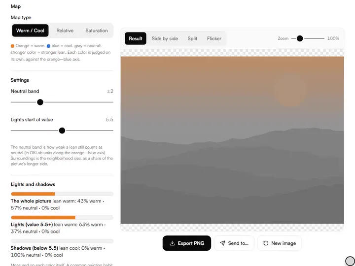
What the Color Temperature & Saturation Map does
The Color Temperature & Saturation Map shows warm and cool as a pattern, with warmth as a number and strength that follows chroma.
Warm and cool as a pattern
The Color Temperature & Saturation Map gives every pixel a signed warmth (its OKLab chroma measured along the orange–blue axis) so the warm and cool masses of a reference read as two colors at a glance. Among the color tools for artists on this site, it is built for reading temperature across a whole reference photo.
Warmth as a number, not a bin
Warmth is the pixel's color projected onto the axis from blue (hue 235° in OKLab) to orange (55°): positive is warm, negative cool. Greens and magentas sit across that axis and come out near neutral, and a Neutral band slider sets how weak a lean still counts as neutral.
Strength follows chroma
The map's color strength grows with the size of the lean, from the edge of the neutral band to full orange or full blue, and the Lights and shadows panel reports how warm or cool the lights and the shadows are, split at a value you choose.
Chroma without hue
The saturation map writes chroma as a gray level, from black at zero to white at a chroma of 0.15 and above. Hue plays no part in it, so a saturated blue and a saturated red both come out white.
Forms kept underneath
The temperature map keeps each pixel's lightness as a faint shift in its base gray, so forms and edges still read under the false color. The shift stays within a narrow band of middle grays, so the map never turns into a value study.
Photos stay on the device
Both maps are computed in a web worker in your browser, and your image is never uploaded. Photos with a long edge over 1,600 pixels are previewed at a reduced size and mapped again at full size for export.
For painters planning warm light against cool shadow
Beginners, working painters, illustrators and art teachers read the maps to plan warm light against cool shadow.
Beginners
Load the Landscape sample and drag the Split position slider to match each orange or blue area to the passage beneath it.
Working painters
Open the Saturation map on a reference and find its brightest white spot to see where the photo puts its strongest chroma.
Illustrators
Run the Warm / Cool map on a finished digital piece to check that the warmest passage sits on the focal area.
Art teachers
Use the Flicker compare view to alternate a photo with its temperature map in front of a class.
Temperature is relative: that's why a map helps
Warm and cool are the slipperiest words in painting because they only exist in relation. A yellow ochre is warm against ultramarine and cool against cadmium orange. What a painter actually needs from a reference is not absolute temperature but the pattern: where the warm masses sit against the cool ones, and which passage is the warmest-warm and coolest-cool. The eye adapts constantly and flattens these relationships; a false-color map does not adapt. It shows you the thermal weather of the image at a glance: the warm cheek against the cool shadow side, the sunlit warm foreground cooling as it recedes.
Temperature also shapes a color scheme. Once the map shows where a reference runs warm, the color wheel shows which hue sits opposite that warm passage, the complement you can set against it in the cool areas.
Reading the saturation map
Chroma is the other axis beginners underrate. The saturation map renders chroma as a grayscale: the white spots are your saturated accents, the dark mid-tones are the quiet bulk of the image. Many strong paintings mirror this structure: mostly grayed, low-chroma color with a few saturated punches at the focal points. If your saturation map shows white everywhere, expect a painting that shouts everywhere and says nothing.
A working check: find the single most saturated spot in the map. Is it on your intended focal point? A camera can put the hottest color on an irrelevant detail: a car, a sign, a passerby's jacket. When you paint, you get to move that accent. The map tells you where the reference put it so you can decide whether to keep it there.
Using the maps together
Temperature and saturation are the two halves of color planning. A practical routine: check the temperature map for the warm/cool pattern you'll organize the painting around, then the saturation map to decide where your chroma budget goes. Warm and saturated at the focal point, cool and quiet in the supporting areas is a long-standing recipe in representational painting, and the two maps show whether your reference supports it or needs redesigning.
Value sits underneath both. The value checker turns the same reference into grays on the 1–10 scale, so you can see whether the warm focal passage also holds the lightest light or the strongest contrast.
Further reading
The page below goes further into the ideas the Color Temperature & Saturation Map works with, and opens on the site named beside it.
- Handprint: color temperature and warm/cool relativity (handprint.com)
Tips from a working artist
From Sujith Puthran, artist and founder: what I actually do at the easel.
Compare the map against the original with the split view while squinting: you'll feel the moment the pattern clicks.
In portraits, check that the temperature map shows warmth concentrated in the cheeks, nose and ears; if the map says the background is warmer than the face, your focal point will drift.
Landscape rule of thumb to verify on the map: warm light means cool shadows and vice versa. If the map shows warm lights AND warm shadows, the photo is lying or filtered.
Export the saturation map and use it as a guide layer: paint the dark (quiet) zones first, save your purest pigments for the white zones.
Why your picture stays on your device
The Temperature Map is a program your browser downloads and runs by itself. When you choose a picture, the browser reads it from your files and does the work on your own phone or computer; no copy is sent to this site or to anyone else, and what you export is saved straight from the browser. That is why there is nothing to upload and nothing to sign up for. The privacy page says what the site does collect.
Questions about the Color Temperature & Saturation Map
The 6 questions below explain how the two maps are read, then why a photo looks duller on the map, file size and privacy.
Reading the maps
What does the saturation map show?
The saturation map shows chroma rendered as brightness: white areas are fully saturated, black areas are neutral gray. It shows where your color accents are and how much of the image is quiet color.
How are warm and cool decided?
Each pixel's color is converted to OKLab and measured along the orange–blue axis: reds, oranges and yellows come out warm, blues and cyans cool, and grays near zero. Relative mode then compares each passage with the mean of its surroundings, which is how temperature is judged in painting.
Why do some colored areas stay gray on the temperature map?
A colored area stays gray when its lean along the orange–blue axis is inside the Neutral band. Greens and violets lie across that axis, so they lean little either way; widen or narrow the band to taste.
Your photo
Why does my photo look less saturated on the map than it does to my eye?
Your photo looks less saturated on the map than to your eye because the map measures chroma on a fixed scale, while the eye adapts to the colors around it and judges each one in context. A passage that feels vivid beside neutrals can measure as moderate chroma, and the map shows that measured figure, which is what your paint will actually have to match.
Does the exported PNG keep my photo's full size?
Yes, the exported PNG keeps your photo's full size. The export recomputes the chosen map from your full-resolution photo, even when the on-screen preview was reduced to 1,600 pixels on its long edge.
Is my image uploaded?
No, your image is not uploaded. The maps are computed entirely in your browser; the image never leaves your device.
Drop in a reference, read the Warm / Cool map against the original, then switch to Saturation to decide where your strongest color belongs.
Free · No sign-up · Runs in your browser