Free Simultaneous Contrast Lab
Place one colour on two backgrounds and see it change; find, as Albers did, two different colours that look the same on different grounds; and isolate a patch of your own painting on neutral grey to judge it apart from its surroundings. The predictions come from the CAM16 colour appearance model. Exports PNG. Free, with no sign-up, and it runs in your browser.
Reads darker: like #a3a3a3 on grey (ΔE 0.054)
Reads lighter: like #bfc0c0 on grey (ΔE 0.037)
The patch is physically identical on both sides. The inset in each corner shows, on neutral grey, the colour CAM16 predicts it looks like there.
CAM16 predictions.Each surround is the patch's background in CAM16; the prediction is the colour that looks the same on neutral grey.
Albers: two colours, one look.Computes the second colour that matches your first across two grounds, the classic Interaction of Color exercise.
A patch of my painting.Click a spot of your painting to see it on its surroundings and isolated on neutral grey, like a hole in a grey card.
Plates.Six demonstration setups: grey on white and black, on red and green, on blue and yellow, and three coloured patches.
- Free
- No sign-up
- Runs entirely in your browser
What is a simultaneous contrast demonstration?
A simultaneous contrast demonstration shows one physical colour on two different backgrounds, side by side, so the identical colour appears to change with its surround: a color contrast illusion. This lab also predicts the change with the CAM16 appearance model and shows, on neutral grey, the colour the patch seems to become.
How to use the Simultaneous Contrast Lab
The tool takes 6 steps, all on your device.
Choose an exercise: One colour, two looks; Two colours, one look (Albers); or A patch of my painting.
For the first, type a patch and two surrounds as hex codes, or pick a plate such as Grey on red and green. The inset in each panel's corner shows, on neutral grey, the colour the model predicts the patch looks like there.
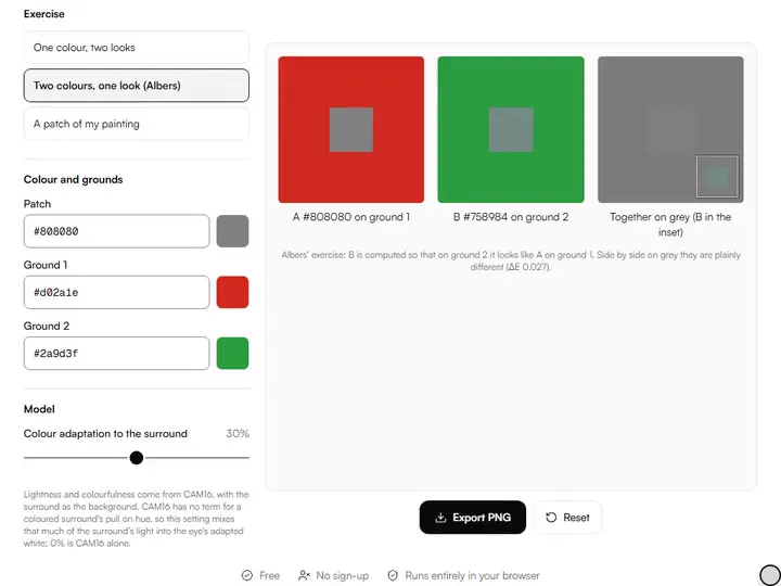
For Albers, type colour A and two grounds: the lab computes colour B that looks like A when B sits on the second ground, then shows A and B together on grey, where they are plainly different.
For your painting, load a photo and click a patch: it appears on its averaged surroundings and alone on neutral grey, with how the model says the surroundings change it.
Set how much the eye adapts to a coloured surround, from 0% (CAM16 alone) up to 60%.
Export the view as a PNG: a teaching card for the first exercise, captioned panels for the others.
What the Simultaneous Contrast Lab does
The Simultaneous Contrast Lab sets one patch in two surrounds, models the shift with CAM16, and computes Albers's match.
One patch, two surrounds
The Simultaneous Contrast Lab paints one physical patch at the centre of two panels, so any difference between the sides comes from the backgrounds and not from the patch. It sits with our color tools for artists as the lesson in context: how a colour reads once other colours surround it, rather than how it is mixed.
CAM16, with the surround as background
CAM16, the colour appearance model Li and colleagues published in Color Research & Application in 2017, includes the luminance of the area around a colour as its background term: a dark background raises a colour's predicted lightness, a light one lowers it, and a dark background also raises colourfulness. The lab computes the patch's appearance on each surround and then the colour with that same appearance on a neutral grey of 20% luminance, #7c7c7c. The implementation is checked against the colour-science library to three decimals.
Hue induction, as a stated setting
CAM16 has no term for the pull of a coloured surround on hue. The lab models it as partial adaptation to the surround: the eye's adapted white takes in a share of the surround's own light, 30% by default, so a dark surround barely pulls and a bright coloured one pulls most. At 0% the prediction is CAM16 alone. The share is a setting you can change, not a measured value.
ΔE as straight-line distance
Each ΔE reading is the distance in OKLab between two colours, after the prediction is rounded to sRGB. As in the CSS colour specification's gamut mapping, 0.02 is treated as about a just-noticeable difference.
Albers's match, computed
For Two colours, one look, the model runs forward on the first ground and backward on the second, giving the colour that should look like colour A there. When the screen cannot show it, the lab says so and uses the nearest displayable colour.
In your browser, in the link
Every calculation runs in your browser and a painting photo is never uploaded. The exercise, colours and settings are stored in the page address, so a copied link reopens the same demonstration.
For teaching and judging color in context
Art teachers, art students, working painters and illustrators use the lab to teach and to judge color in its context.
Art teachers
Show a plate as a color perception demo, then run Albers's exercise so a class sees two different colours read as one.
Art students
Put a neutral patch between two complementary surrounds and compare the insets on grey.
Working painters
Click a passage of a painting in progress to see how its surroundings are changing it before you remix it.
Illustrators
Test a flat fill against two candidate backgrounds before committing to either one.
What is simultaneous contrast?
Simultaneous contrast is the change in how a colour looks caused by the colours around it. A grey patch looks darker on white than the identical grey on black, and a neutral patch on a strong red leans toward red's complement, a greenish cyan; on a strong blue it leans toward yellow.
The French chemist Michel Eugène Chevreul set out his law of the simultaneous contrast of colours in a book published in 1839. Josef Albers's Interaction of Color (1963) later taught the same relativity of colour through exercises with coloured paper, including making one colour look like two and two colours look like one.
Reading the predictions
With the defaults, the light grey #b4b4b4 reads like #a3a3a3 on white (ΔE 0.054) and like #bfc0c0 on black (ΔE 0.037). A mid grey, #808080, reads like the greyish blue-green #6f8384 on pure red and the greyish yellow #8a8a77 on pure blue, each leaning away from its surround's hue. With adaptation at 0% the grey on red stays grey, #7f7f7f: pure red is about as light as the reference grey, so CAM16 alone predicts almost no change there.
These are screen complements, not a painter's. The color wheel shows both, with RYB complements for paint and OKLCH hues for screen work.
The hue shifts assume normal colour vision. For viewers with a colour vision deficiency the pairs that separate differ, which the color blindness simulator shows for any picture.
Two colours, one look
Albers asked students to find two different papers that look the same on two different grounds. The lab computes the second colour: for the default light grey on white and a match on black, the answer is a darker grey, #949393, which on black should look like #b4b4b4 on white. Side by side on neutral grey the two are plainly different, ΔE 0.106.
Judging a patch of your painting
Painters isolate a colour by looking at it through a hole in a grey card, because its neighbours change how it reads. The painting exercise does the same: it averages the ring of colour around the point you click, predicts how that surround changes the patch, and shows the patch alone on neutral grey to match against. A neutral grey beside a warm colour looks cooler, and beside a cool colour warmer, so a grey passage can often be tuned by its neighbours instead of by remixing; the complement neutralizer mixes those chromatic greys.
Further reading
The 3 pages below go further into the ideas the Simultaneous Contrast Lab works with, and each opens on the site named beside it.
- Simultaneous Contrast: Wikipedia (en.wikipedia.org)
- Josef Albers, Interaction of Color (1963): the classic text (albersfoundation.org)
- Li et al. (2017), Comprehensive color solutions: CAM16, CAT16, and CAM16-UCS (doi.org)
Tips from a working artist
From Sujith Puthran, artist and founder: what I actually do at the easel.
Start with the Grey on white and black plate: it is the clearest demonstration of lightness contrast.
For hue, use a strong surround and a neutral patch, as in the Grey on red and green plate.
Set the adaptation to 0% to see what CAM16 alone predicts, then raise it to add the hue pull.
Questions about the Simultaneous Contrast Lab
The 5 questions below cover a patch that looks unchanged, the corner inset and paint on canvas, then CAM16 and its adaptation figure.
Using it
Why does the patch look the same to me on both sides?
The patch can look the same on both sides because the effect is weaker on a low-contrast screen or in bright room light. Try a darker room, a brighter screen, or higher-chroma surrounds.
What is the inset in the corner of each panel?
The inset in the corner of each panel shows the model's prediction: on neutral grey, the colour that looks the same as the patch does on that surround. Turn it off to show only the physically identical patches.
Can I use this to predict how a paint colour will look on my canvas?
Only qualitatively: you can use this to predict the direction a paint colour will shift on your canvas, not the amount. Canvas texture, lighting, the size of neighbouring areas and viewing distance all change the real shift. Use it to understand the direction, then test the actual paint.
The model
What is CAM16?
CAM16 is a colour appearance model published by Li and colleagues in 2017, the successor to CIECAM02. It predicts lightness, chroma and hue under given viewing conditions, including the luminance of the colour's background, which is what makes it suitable for simultaneous lightness contrast.
Is the 30% adaptation figure measured?
No, the 30% adaptation figure is not measured. It is a setting that makes the hue pull visible, chosen for the demonstration. The lightness and colourfulness changes come from CAM16 itself; the hue part depends on this setting, which you can set from 0% to 60%.
- CAM16: doi.org/10.1002/col.22131 · checked 2026-09-29
Set a patch, choose two surrounds, then try Albers's exercise and a patch of your own painting.
Free · No sign-up · Runs in your browser